Mandelbrot set experiments

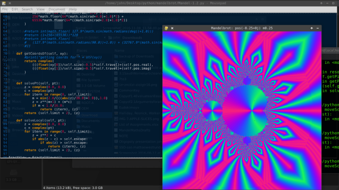
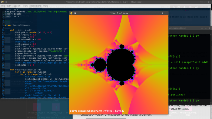
Over spring break, I decided I still wanted a better understanding of how points in the Mandelbrot set moved. I also wanted a more flexible fractal generator than my current one.

So I stripped my ‘Mandelphone’ project down to nearly nothing, and rebuilt it into yet another program that can’t be moved back to my phone because it includes Pygame. I hope to clean up my code and post it here soon.

one of my first experiments was to generate the Buddhabrot; Not to answer my real questions, but as a topic for my code – a way to work out a good design. I settled on a large class FractalPanel with several global parallel arrays, and switches to enable/disable certain actions on them.

My explanation (excuse) for using many parallel arrays is that I thought it was faster. After asking about python’s performance in such situations on Quora, I got a clear and concise answer from Simon Lundberg: pointer dereferencing overhead is negligible, because nothing in python is ever in the cache. The next thing I do will be to refactor everything.

But many things will stay the same. The two most important arrays are bucket[][] and raster[][].

Bucket[][] stores the complex starting positions for every pixel in the screen. By storing them in an array, I can easily update them (e.g. to iterate them all and show where every point is after n iterations, then n+1, then n+2, whatever.)

Any methods I have for drawing an image write their results to raster[][] which is copied to a pygame.Surface and drawn at the end of a frame. I have separate methods to rasterize a Buddhabrot from the starting coordinates in bucket[][], or to rasterize the coordinates in bucket[][] itself in various ways.

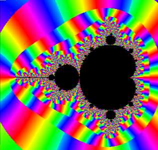
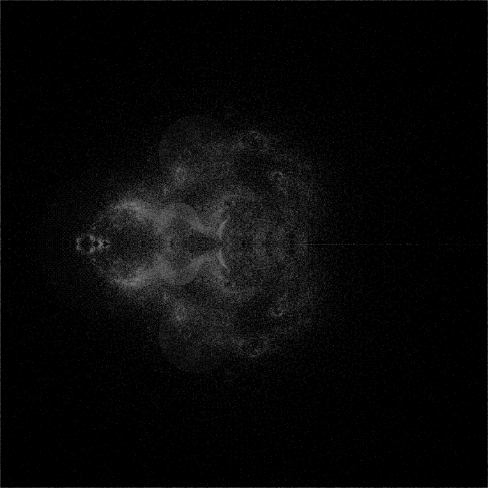
I started by creating a simple Buddhabrot:

BB-sequenceB-0
The Buddhabrot

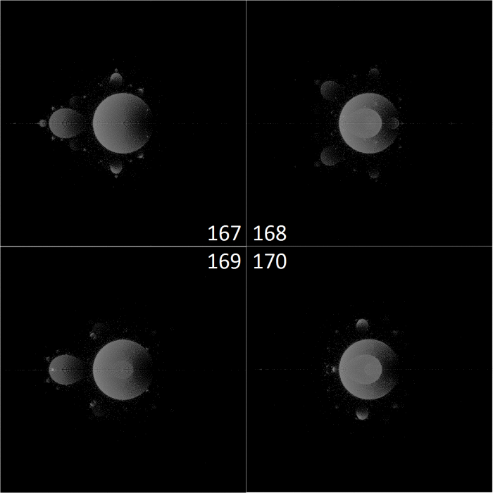
These images of the Buddhabrot represent all pixels visited by every Z which started at a coordinate in the bucket. To get more starting points for a more detailed image, I simply iterated the points in the bucket, to get new buckets. (While the images show only the motion of unbounded points, the bucket of starting positions contained both bounded and unbounded points. And YES, as they travel, many bounded points regularly visit coordinates that aren’t bounded when used as starting positions.)

Near the end of the sequence of images, the Buddhabrot is much dimmer, as many unbounded points in the bucket have escaped and aren’t being used as starting points anymore:

BB-sequenceB-423
Buddhabrot after 423 iterations of the bucket.

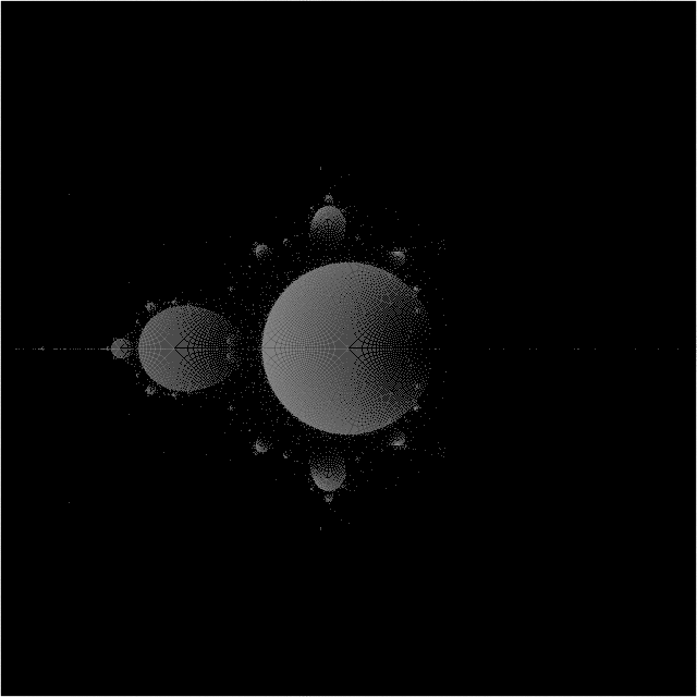
Finally, I combined my 430-frame PNG sequence into a single image:
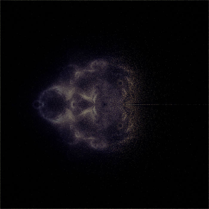
BLENDED_4_BB-sequenceB-
A composite of all images in the sequence

Coloration:

  • red = percentage of the time a pixel is ever occupied.
  • green = root-mean-square of pixel brightness, multiplied by 2.5
  • blue = mean of pixel brightness, multiplied by 1.5

The original images were colored using an Arctangent normalized to 255. Here’s the relation between times visited and luminosity:

conversionRate
input is horizontal (it wraps around), output is vertical (distance from top)

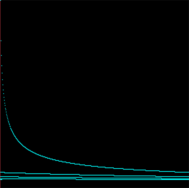
I regret how much information is lost by the steep increase in output brightness for single-digit inputs, but my goal was for such points to be visible to the naked eye, with no need to brighten the image in Photoshop. And there’s little need to extract actual numbers from these images, as it would be faster to just regenerate them.

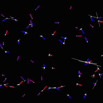
Using points visited by bounded paths as the starting points for unbounded ones gave me some interesting patterns that I’ve never seen before, which I might continue to investigate. but honestly, I’ve always felt that the Buddhabrot was like looking for shapes in the clouds – it doesn’t provide much insight into how points are actually moving. The Anti-Buddhabrot accomplishes this better, I feel, because it helps you see the periodicity of densely traveled paths. (the Anti-Buddhabrot consists of the pixels visited by all bounded points)

fold-sequence-A-periodicity-demo-x1280
iterations 167-170 of a composite Buddhabrot and Anti-Buddhabrot, which is basically just an Anti-Buddhabrot by now because most of the points in the Buddhabrot have escaped

The left bulb, with a periodicity of 2, moved can be seen moving in and out of the cardioid in a simple 1 – 2 – 1 – 2 fashion. The top and bottom bulbs, however, are moving in a triangle. 1 – 2 – 3 – 1.

I wanted to see more of this, which led me to my next experiment.

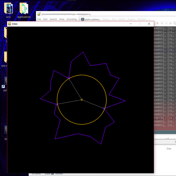
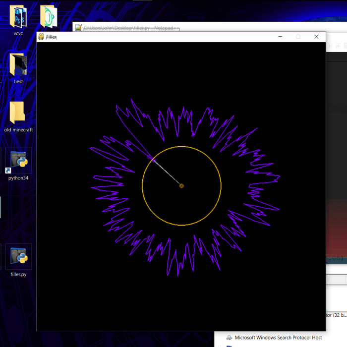
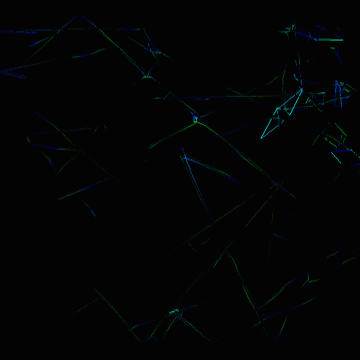
Drawing lines instead of points.

lineFixTest-sequenceA1-x1920-359
Iteration 359: The cycles from many major bulbs suddenly line up! They simultaneously exit the cardioid and return to the area they started in.

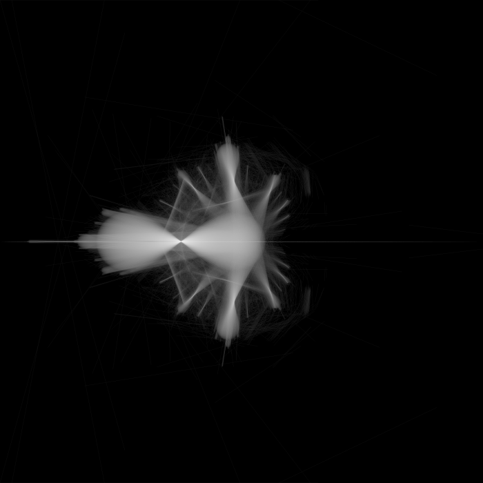
The above image is simply the paths taken by all points as they transform from this:

bucket-sequenceA-358
Rasterization of all points at 358 iterations

…to this:

bucket-sequenceA-359
Rasterization of all points at 359 iterations

In fact, in the image of all points at 358 iterations, two bulbs can be seen that haven’t coincided with all the others. Their movement during the 259th iteration forms the two lines that are perpendicular to the spokes of the linear movement image, near the left of the cardioid.

Mandelbrot path illustrations

A couple months ago, I used my Mandelbrot generator to create several animations. The purpose of these animations was to gain a better understanding of the paths that an iterated point takes before escaping. I knew that they didn’t travel very far around the number plane – but besides that, I didn’t know much. This project shows how the Mandelbrot set behaves when the escape threshold is not a circle.

The ideal tool to understand how the points move would be a Buddhabrot generator that can limit displayed paths to show only the points around the mouse pointer. I’m still interested in doing that, but this provides other useful information.

In all of these image, yellow is a low escape angle, magenta is a high escape angle, and higher iteration counts shift the color through blue, green, and red. This is very faint around the edges of the set. Whenever I would need to divide by zero to find the escape angle, I instead used magenta – this resulted in the dark lines through the middle of yellow regions.

escapeshapeelipserot

In the rotating parabola experiment, I mainly wanted to see how far a point could travel in a straight line. If I used two planes as the escape shape, certain points would never escape (any point where i=0 for example.) The parabola guarantees that points will escape eventually. In this test I actually rotate the points before testing, while the parabola stands still – but for the same effect.

The parts of the set that are near the center of the parabola are the most defined, taking the longest to escape. Each shape within the parabola has a purple strip which is offset from the purple strip in the next shape. To me this implies that the longer a point is iterated, the larger the step that finally takes it out of the parabola.

escapeshapeexp

I created several other animations with different escape shapes. They demonstrate another property of the Mandelbrot set – No matter how you define “escaped,” as long as it is outside of a radius 2, no new region added will join the opposite sides of the set; The set remains connected.

escapeshapehyp

escapeshapehyprot

escapeshapesquarerot

The set contains the same points no matter what the escape shape is – so using a square escape is actually a decent shortcut to remove the distance equation from each iteration.

Filler

This weekend, I started to work on a program that will take any shape and fill it with the largest possible inscribed circles. Something like this:

outlinenumbered

One of the reasons I am interested in doing this is to create a music visualizer. If similar shapes produce similar sets of circles, I can manipulate the shape using sound and get smoothly shifting circles. But to test the algorithm, I started with a random shape generator.

filler1080x1080

Each point is based on a random radius and angle, but the angle is always increased to avoid looping the shape over itself.

The algorithm I’ve drafted on paper has changed a lot, but it always has these components:

  • A spline which provides information about the nearest points to a location.
  • A seed method, which chooses a starting point for a seed circle of radius 0. It selects the center of the spline if there are no circles yet. Later it will select from known open spaces in a “fit bin” – if no such spaces are stored, it will choose a tangent point on the largest circle.
  • An expansion method, which repeats certain steps until the seed fills its surroundings and has 3 tangent points with the spline or other circles.
  • A resolution method, which uses the expansion method to expand the seed, but then attempts to fit this seed into other spaces to see if it can get any bigger. If there is a larger space for the seed, the current seed location and size are saved as an entry to the fit bin, the seed is placed in the larger space, and the method starts over.

I also hope to develop a system for limiting the portions of the spline and circle set that need to be checked continuously during the expansion method. This could take the form of data stored by circles about the places they touch the spline. (If a seed next to a large circle is between two of the large circle’s tangent points to the spline, a and b, then only points in the spline between the indexes a and b need to be checked)

fillersplinesearchlimitersketch

This range could be limited further, to within the outer tangent points of any connected circles around the seed. In the ideal program, the spline will be ignored completely for a seed surrounded on all sides by circles.

The first basic step to my expansion function is to find the 3 nearest points of either circles or the spline, and to set the seed’s radius to the average of their distances.

filler4average1080x1080

Using the basic seed method with only a spline present, the seed often looks perfect after the first step. However, it is guaranteed to overlap at least one point. The next step is to move it directly away from the closest/most overlapped point until it is tangent to that point, and start over. It will be closer to the other two points after moving away from the first, usually…

filler5problem1080x1080

…unless they’re all bunched together. (I caused this problem by smoothing a spline with many points.) In this case, the seed will still expand and move away from the spline until it touches other points, but it may do so very slowly. Luckily, the seed will never have this problem when interacting with placed circles, because a circle will only provide one point as the nearest to a location.

The greatest challenge of this project? speed. I want to save enough frames to render a 30fps music video, with at least 64 circles in each frame. It could easily take days if I approach this the wrong way.

SugarSort

sugar2

This was inspired by the physics of the game Sugar, Sugar. It’s a neat flash game I remember from my childhood (7 years ago). At the top of each level, there are the words “Sugar, Sugar.” Sugar pours out of the comma, and you must direct it to the various coffee mugs by drawing ramps with the mouse pointer

It’s interesting because it simulates particles only by manipulating pixels – there is no gravitational acceleration, and this allows quite a lot of sugar to be simulated.

so I decided to create a sorting-based physics engine in python. This isn’t about to be implemented into a similar game, mainly because I got sidetracked. Bob Ross says there are no mistakes, just happy accidents. Instead of pulling sugar straight down, this one sorts in random directions to create an interesting pattern. This is a 2-dimensional bubble sort with a twist – it swaps only within single pairs of values, preventing a value from traveling farther than 1 square per frame.

Corrupted Bubble Sort continues…

I wanted a much better image of the curve I produced before I posted a question, so I re-made my algorithm in Python. It has a simple Pygame visualizer.

sortapproachpython1
720×720 Corrupted Bubble Sort, in an early stage of sorting.

Python is plenty fast for these tests, and it allows me to quickly complete simulations with decent settings.

sortapproachpython3
8192 samples, 8192 possible values -> 768×768 screen resolution, completed simulation with derivative.

I represent the derivative of the curve in yellow. Usually this is a rather messy line, because of the large amount of randomness that still exists in the sorted samples. (I also waned the odds of randomization too quickly in the above image, resulting in a misshapen curve with a steeper drop on one side.)

To get a smoother curve, I run many simulations in parallel, then draw the average.

sortapproachparlin4-4096-800-complete-s
The average of 4096 simulations of 800 samples – this is the image I used for my question on Quora.

I posted this question on Quora. Lev Kyuglyak responded that it may be a logistic function that produces a sigmoid curve, and that it could be can be represented in the form:

f(x)={\frac  {L}{1+{\mathrm  e}^{{-k(x-x_{0})}}}}

I am skeptical that my program can create a real sigmoid curve, because those graphs have an infinite domain, while the results of my simulations always have a domain of exactly [0,1]. perhaps my program compresses that infinite distance into a very small space as it approaches the left or right of the array. I’m currently thinking of ways to modify my program to have a much larger domain around the point of inflection.

The first change I’ve tried is to modify the probability of randomization with the difference between a traveling sample and its surroundings. samples that are closer in value to their surroundings have a lower chance of randomization and thus travel farther, perhaps forming larger flat areas at the start and end of the curve.

They kinda do, but not in the way I expected.

sortapproachrelative5-1024x-finished

Weirdness!

Gravo2D

Yesterday I wanted to remake my Gravo project using Pygame. It’s Christmas break, so I was actually able to do that.

Here I represent each particle with a line of a length proportional to its speed:

gravo2d-0-force-spokes

The white lines represent each force acting on a particle at any given time. When two particles pass near each other, the forces grow larger and the lines reach farther.

The twinkling effect is rather cool, but I was more interested in the movement of the ends of those force lines. Further experimentation led me to create this:

gravo2d-a

Here, lines are drawn following each particle, but floating away from it at a distance determined by a force. Each particle has a line corresponding to each other particle. these lines create a figure 8 or an hourglass when two particles slingshot around each other. the color of the line is also determined by the forces acting on a particle (bright green represents a strong horizontal force, bright blue represents a strong vertical force)

I found that I could add at least 64 particles without significant lag:

gravo2d-b-more-particles

Finally, I began to experiment with zooming effects. previously, I have been dimming  the screen and painting over it again to produce the echo. Now I store the current frame to be painted in the background of the next frame.

gravo2d-d-smooth-zoom

Here’s my code:

import random as rand
import pygame
import pygame.event
import math

size = [720,720]
screen = pygame.display.set_mode([1280,720])
pygame.display.set_caption("gravo2d")

back = pygame.Surface([1280,720])

class particle:
	
	def __init__(self, groupSize):
		self.pos = (rand.uniform(0.0,1.77777777), rand.uniform(0.0,1.0)) #start anywhere
		self.vel = (rand.uniform(-0.01,0.01), rand.uniform(-0.01,0.01)) #start with a random velocity
		self.charge = rand.uniform(0.5,1.5)*(rand.randint(0,1)-0.5) #charge varies but is never nearly 0
		self.mass = rand.uniform(0.95, 1.05) #mass affects response to forces
		self.color = [int(128+self.charge*128),0,int(128-self.charge*128)] #particle color is based on charge
		self.forces = [] #all forces between this particle and particles of higher index (longest for the first particles)
		self.forceIndex = 0 #the force currently being edited by the simulation
		self.sharedForce = (0.0,0.0) #the equal and opposite force that the simulator uses for the other particle in the pair
		for i in range(groupSize+1):
			self.forces.append((0.0,0.0))
		self.netForce = (0.0,0.0) #modified many times before being acted upon and reset to 0
		
	def addForce(self, drawOnto, f): #used to inform a particle of the force from another particle.
		#add force to net forces
		self.netForce = (self.netForce[0]+f[0],self.netForce[1]+f[1])
		#color with velocity influencing red component, horizontal force for green and verticle force for blue.
		color = [int(511*abs(self.vel[0]+self.vel[1])),(160*math.atan(10000.0*abs(f[0]))),(160*math.atan(10000.0*abs(f[1])))]
		#represent increase in force with a line who's distance from the particle increases.
		self.drawLine(drawOnto, color, [self.pos[0]-self.vel[0]+self.forces[self.forceIndex][0]*64,self.pos[1]-self.vel[1]+self.forces[self.forceIndex][1]*64], [self.pos[0]+f[0]*64,self.pos[1]+f[1]*64], 4)
		#forces[forceIndex] stores this force until next tick  to start the next line segment at the end of this one. sharedForce holds the last force when recording this force, so that the subseuent simulation of the other particle in this pair can use it later in the tick.
		self.sharedForce = self.forces[self.forceIndex]
		self.forces[self.forceIndex] = (f[0],f[1])
		#next time, dealing with a force from a different particle, remember a different last force.
		self.forceIndex += 1
		return color
		
	def acceptForce(self, drawOnto, f, previous, color): #used when an unknown particle of lower index forces this one.
		self.netForce = (self.netForce[0]-f[0],self.netForce[1]-f[1])
		self.drawLine(drawOnto, color, [self.pos[0]-self.vel[0]-previous[0]*64,self.pos[1]-self.vel[1]-previous[1]*64], [self.pos[0]-f[0]*64,self.pos[1]-f[1]*64], 4)
		
	def move(self): #move based on velocity
		self.pos = (self.pos[0]+self.vel[0],self.pos[1]+self.vel[1])
		
	def react(self): #accelerate based on net force
		self.vel = (self.vel[0]+self.netForce[0]*0.1*self.mass,self.vel[1]+self.netForce[1]*0.1*self.mass)
		self.netForce = (0.0,0.0)
		self.forceIndex = 0
		
	def bounce(self): #bounce off the walls
		if (abs(self.pos[0]-0.88888888)>0.88888889): #left and right sides
			self.vel = (self.vel[0]*-0.9,self.vel[1]*0.9) #reverse direction
			#find new position by mirroring over the edge once past it:
			self.pos = (abs(self.pos[0]) if self.pos[0]0.5): #top and bottom sides
			self.vel = (self.vel[0]*0.9,self.vel[1]*-0.9)
			self.pos = (self.pos[0], abs(self.pos[1]) if self.pos[1]

Corrupted Bubble Sort

Recently, I saw a fascinating imgur post that visually demonstrates how various sorting algorithms work. I wanted to invent some of my own sorting algorithms with visuals, so I started a new scratch project.

The first two algorithms I added to the project were Bubble Sort and another which I don’t know the name of. it traverses the array to find the minimum after this item, then swaps that minimum with the current item and moves to the next item. Simpler and faster than Bubble Sort, but Bubble Sort has more interesting visuals in my opinion.

I really enjoy jumping into projects without doing any research at all, and I actually mirrored some concepts found in FLAC with my blind draft of a lossless audio codec. passes of increasing sample rate, each only storing the inaccuracies of the previous one – this is what I understand bit peeling to be. I’m sure that leaping without looking has a lasting effect on how I understand these things, even after I read the Wikipedia article on them. It also probably delays my exposure to new concepts, but it’s a very fun way to learn…

The visuals of these algorithms are mesmerizing, and I think they would make good screen savers. That’s what led me to modify the Bubble Sort algorithm to never finish. Each time two array items are switched, each has a very low chance of being set to a random value. I expected it to look like a normal Bubble Sort, with just a bit of noise to make the odds of it finishing very low.

But I did not get chaos.

stagesortapproach

This uses only random values.

I’ve modified my program so that the chances of an item being randomized decrease over time, so this program will eventually halt with a nearly perfect curve.

Here’s what I notice:

  • samples with extreme values often travel the farthest.
  • samples that come to rest near the edges hardly ever change
  • samples near the middle, being more random, are swapped and randomized most often.
  • Samples that travel farther have a greater chance of being randomized again before coming to rest.
  • samples approaching the edges can only randomize samples with less extreme values.
  • samples near the edges, when randomized, often become less extreme and move towards the center.

so what is the curve? it looks like part of a sine wave, or perhaps an arctangent.

But since everything about the process is linear – the increasing probability of randomization with increasing number of swaps – or increasing exponentially, e.g. the increasing probability of randomization in the wake of a traveling sample as it randomly creates more samples that will travel… It might be the integral of a parabola. I’m not sure how, but I won’t rule it out.

This is a Quora question if I’ve ever seen one. I’m just waiting to get a better screenshot. the odds of randomization are now 162:1 and increasing.

…finished!

stagesortapproachf

It doesn’t look like a sine wave to me – but maybe that’s because the odds against getting extreme samples were so high that the crest and trough couldn’t be built before I terminated it. There’s a small chance that I’ve discovered a new way to calculate some constant like π or e. but I still don’t know what kind of curve it is.

To the internet!

Pygame mandelbrot

I’d like to share my progress on a new project. I’ve had a couple of breakthroughs, but I haven’t found the time to post them. I’ve created a Mandelbrot generator in python. It was based on the successful ASCII-output Mandelbrot generator, and it still uses a console window to receive input.

It started with the ancient tradition of using screen coordinates as color values because your code is producing a blank screen and you don’t know why.

screenshot_2016-11-08_09-35-43
(using x+y as a color index)

This was also a great way to test my color palette, which I eventually refined into a very simple Red->violet->Blue->Green sequence that I’ve never seen in another generator:

MandelPy-3-color-palette

MandelPy-3-color-palette-2

I’ve performed many experiments with this generator, which I hope to post someday. I’ve replaced the input handler with a loop that modifies certain parameters, and I’ve produced some attempts at a slowing expression that uses z -> z^(m+1) + (m*C) with m moving from 1 towards 0 as |z| increases. The point of that is to produce a final resting place of the process without using a simple escape threshold or limit. It cuts off when m drops below a certain value. Here’s what that looks like:

mandelpy-m-decays-then-angle-is-found
Color = termination angle

I’ve also created some sequences with varying escape threshold size and shape, to help demonstrate the areas that certain groups of points mostly live in. Here’s a frame from a sequence with an expanding threshold:

mandelpy-animated-expanding-threshold-crucifix-angle-iter
Colored with angle and iteration count

I’ll convert these PNG sequences to GIF’s and upload them here soon.

Scratch Mandelbrot Again

I love Scratch, and Python. They are so slow, yet they are so fast to develop with… When I started experimenting with c++, it was weeks before I even saw my fractal on the screen. (then it was calculated about 4,000 times as quickly as these images were)

The scratch Mandelbrot generator series isn’t meant to be fast. It is ideal – It will have all of my favorite features. It will allow me to test new mathematical concepts easily (more of this later). It may be a place to draft these ideas before I implement them in Java or something.

I started by improving the colors in Mandelbrot 2. This was a huge task, because I acted on the misconception that the full color wheel of the pen was only available in scratch projects created after a certain date – so I re-created the entire program in another project.

I later disproved this theory about the pen, and I can’t really come up with a new one. it breaks pretty easily if I change the color with a numeric value before a using a color constant, or within too short a time after starting the project, and in other odd situations.

screenshot-2016-10-21-at-17-26-46
https://scratch.mit.edu/projects/126896952/

I focused mostly on improving efficiency and readability – I got rid of the global “running” variable, and made it possible to stop and start the program without restarting generation progress.

screenshot-2016-10-21-at-17-08-09

But all of this is moving towards an ultimate goal of inventing new ways of visualizing and measuring the Mandelbrot set and other Julia sets. I’ve dreamed of creating a set without edges of any kind. and not just by blurring the lines like Xaos does… I want a set that’s not quantized at all.

and angular coloring seems like a good place to start. You can see this is the header image at the top of my site, which I generated with Xaos.

Here’s me using atan(zi/zr) and atan((zi-zio)/(zr-zro)) as the color:

screenshot-2016-10-28-at-09-03-44-edited-angularscreenshot-2016-10-28-at-09-50-47-edited-angular

The second image has the angular result multiplied by 0.2, and added together with the iteration count. This gives the glow around the edges of the set.

Here’s when I simply use zi as the color:

screenshot-2016-10-29-at-09-38-12-edited-zi

The yellow escapes above the real axis, the purple escapes below the real axis.

All of this has been done before. In fact, Xaos combines it all into one application. I’m going to try something new. This is the beginning of an attempt at an unquantized set…

When a group of points is moving towards a higher iteration level, their escape point is only slowly dropping towards the origin. When they finally drop below escape radius, and the equation must be iterated one more time, the new escape point is pretty far away – and the set is quantized no matter what math you use on the escape point.

So I’m going to measure the real point of escape: where the last line segment formed by the last two points crosses the escape circle.

Here’s my implementation of the quadratic formula:

screenshot-2016-10-29-at-11-23-59-edited

Where zr is the real component of the escape point, zi is the imaginary component, and zro and zio are the previous point.

Where m is the slope of the escape line segment, and b is the y intercept of the escape line segment, and A, B, and C are the three coefficients of the quadratic formula.

A more detailed explanation of the math is embedded in the project.

https://scratch.mit.edu/projects/128071393/

Before I started testing this math, I made a few tweaks to allow the generation other Julia sets. So here’s a Julia Set from the seed -0.3-0.9i

I went from this:

screenshot-2016-10-28-at-19-53-07-edited-angular

to this:

screenshot-2016-10-28-at-19-55-01-edited-exact

The yellow strips, corresponding to higher angles relative to the origin, now tilt towards the nearest tips of the prominent features of high iteration count.

I would characterize good outcoloring as that which helps you identify features you would have otherwise missed. So I can’t wait to test this algorithm in a compiled language.

screenshot-2016-10-28-at-17-18-35-edited-angular

screenshot-2016-10-28-at-17-15-24-edited-exact

It really reminds me of a block of ray-traced ripply glass inside a red and yellow world.

screenshot-2016-10-28-at-20-05-31-edited-angular

screenshot-2016-10-28-at-20-01-22-edited-exact

Now that I have two new outcoloring modes, I’ll divide one by the other just for giggles:

screenshot-2016-10-28-at-20-11-10-edited-quotient

Obviously, none of these are images of a truly unquantized set. This is because a point from an area which almost escapes will still travel quite a distance upon their next iteration. And, rather than gracefully leave the escape radius at a point not far along the next line segment (as they would if the next line segment had nearly the same slope), they fall back away from the escape circle at an acute angle – actually dropping in absolute value before they escape a couple radians away.

I have a few more ideas.

I’m also taking major steps in the direction of using clones for a multithreaded approach, as well as rendering a simple Julia set based on the context of the Mandelbrot set.

You can view all of my code here