Recently, I saw a fascinating imgur post that visually demonstrates how various sorting algorithms work. I wanted to invent some of my own sorting algorithms with visuals, so I started a new scratch project.
The first two algorithms I added to the project were Bubble Sort and another which I don’t know the name of. it traverses the array to find the minimum after this item, then swaps that minimum with the current item and moves to the next item. Simpler and faster than Bubble Sort, but Bubble Sort has more interesting visuals in my opinion.
I really enjoy jumping into projects without doing any research at all, and I actually mirrored some concepts found in FLAC with my blind draft of a lossless audio codec. passes of increasing sample rate, each only storing the inaccuracies of the previous one – this is what I understand bit peeling to be. I’m sure that leaping without looking has a lasting effect on how I understand these things, even after I read the Wikipedia article on them. It also probably delays my exposure to new concepts, but it’s a very fun way to learn…
The visuals of these algorithms are mesmerizing, and I think they would make good screen savers. That’s what led me to modify the Bubble Sort algorithm to never finish. Each time two array items are switched, each has a very low chance of being set to a random value. I expected it to look like a normal Bubble Sort, with just a bit of noise to make the odds of it finishing very low.
But I did not get chaos.
This uses only random values.
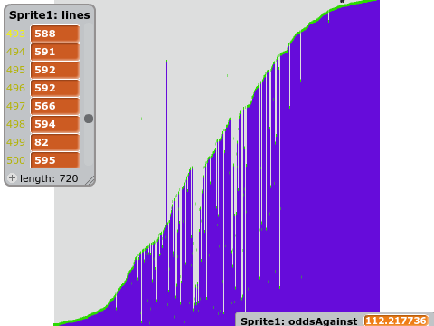
I’ve modified my program so that the chances of an item being randomized decrease over time, so this program will eventually halt with a nearly perfect curve.
Here’s what I notice:
- samples with extreme values often travel the farthest.
- samples that come to rest near the edges hardly ever change
- samples near the middle, being more random, are swapped and randomized most often.
- Samples that travel farther have a greater chance of being randomized again before coming to rest.
- samples approaching the edges can only randomize samples with less extreme values.
- samples near the edges, when randomized, often become less extreme and move towards the center.
so what is the curve? it looks like part of a sine wave, or perhaps an arctangent.
But since everything about the process is linear – the increasing probability of randomization with increasing number of swaps – or increasing exponentially, e.g. the increasing probability of randomization in the wake of a traveling sample as it randomly creates more samples that will travel… It might be the integral of a parabola. I’m not sure how, but I won’t rule it out.
This is a Quora question if I’ve ever seen one. I’m just waiting to get a better screenshot. the odds of randomization are now 162:1 and increasing.
…finished!

It doesn’t look like a sine wave to me – but maybe that’s because the odds against getting extreme samples were so high that the crest and trough couldn’t be built before I terminated it. There’s a small chance that I’ve discovered a new way to calculate some constant like π or e. but I still don’t know what kind of curve it is.
To the internet!
